Averages, charts and scatter diagrams
🎯What you need to be able to do
- Classify and tabulate data (tally tables, two-way tables); read and compare tables and diagrams, and know the limits of the conclusions.
- Calculate the mean, median, mode and range from a list or an ungrouped frequency table, and choose the right average.
- Find quartiles and the interquartile range, estimate the mean of grouped data and find the modal class EXTENDED.
- Draw and interpret bar charts (including stacked and dual), pie charts, pictograms, stem-and-leaf diagrams and frequency distributions.
- Draw and interpret scatter diagrams, describe correlation, and draw and use a line of best fit.
📚The mathematics
Averages and spread
From a frequency table, the mean is \( \dfrac{\sum fx}{\sum f} \) — divide by the total frequency, not by the number of rows. The median is found by counting through the cumulative frequencies. The median is the better average when there are extreme values (outliers); the mode suits data that are not numbers.
EXTENDED The lower and upper quartiles are the medians of the bottom and top halves (positions \( \tfrac{n + 1}{4} \) and \( \tfrac{3(n + 1)}{4} \)); the interquartile range \( = \) UQ \( - \) LQ measures the spread of the middle half and ignores outliers. For grouped data, use each class’s midpoint as \(x\): the result is an estimate of the mean, because the exact values are unknown. The modal class is the class with the highest frequency.
Charts
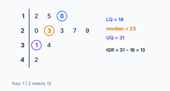
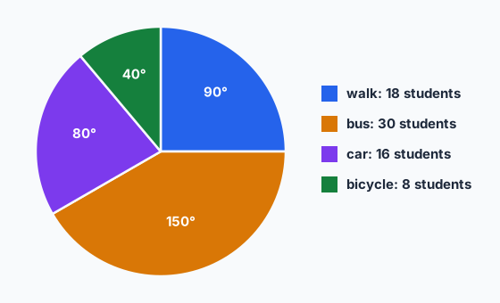
In a pie chart, each sector angle is \( \tfrac{\text{frequency}}{\text{total}} \times 360^{\circ} \). A stem-and-leaf diagram must be ordered and have a key; it keeps every data value, so medians and quartiles can be read straight off it.
Scatter diagrams
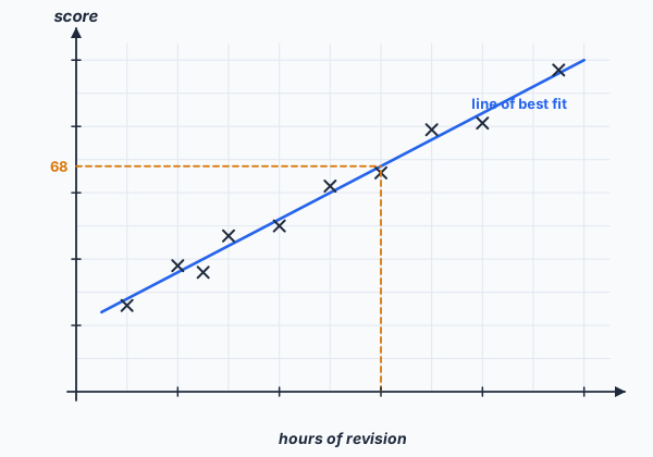
Positive correlation: as one variable increases, so does the other; negative: one goes up as the other goes down; no correlation: no pattern. A line of best fit is a single ruled straight line drawn by eye, following the trend across the whole data set with roughly as many points either side; it need not pass through the origin or any particular point. Use it to estimate within the range of the data — predictions far outside that range are unreliable.
✏️Worked example
(a) \( \sum fx = 0 + 9 + 14 + 15 + 12 = 50 \), so the mean \( = \tfrac{50}{30} = 1.67 \) (3 s.f.). The median is between the 15th and 16th values; the cumulative frequencies are 6, 15, 22, …, so the 15th value is 1 and the 16th is 2: median \( = 1.5 \). Mode \( = 1 \). Range \( = 4 - 0 = 4 \).
(b) Midpoints 5, 15, 25, 40: \( \dfrac{5(4) + 15(11) + 25(15) + 40(10)}{40} = \dfrac{960}{40} = 24 \) minutes. Modal class \( 20 < t \le 30 \).
📝Practise
Questions in the style of the current papers. EXTENDED marks Extended-only content.
1. (Non-calculator.) Find the mean, median and range of 7, 3, 9, 4, 12. [3]
2. (Non-calculator.) The mean of six numbers is 8. One number is removed and the mean of the other five is 7.4. Find the number removed. [3]
3. (Non-calculator.) In a pie chart of 72 students, 18 walk to school. Find the angle of the “walk” sector. [1]
4. (Non-calculator.) Using the stem-and-leaf diagram above, find the median, mode and range. EXTENDED Also find the interquartile range. [4]
5. (Calculator.) EXTENDED Heights \(h\) cm of 25 plants: \( 140 < h \le 150 \): 5; \( 150 < h \le 160 \): 12; \( 160 < h \le 170 \): 8. Calculate an estimate of the mean height. [3]
6. (Non-calculator.) Using the scatter diagram above, describe the correlation, and explain why using the line to predict the score for 20 hours of revision would be unreliable. [2]
7. (Non-calculator.) The salaries in a small company are $2000, $2100, $2200, $2300 and $12 000 a month. Which average best represents a typical salary? Give a reason. [2]
🔗Go deeper — other people’s work
These are external resources, not mine. If one stops working, tell me and everything above it on this page still stands.
- Corbettmaths — averages from frequency tables and estimating the mean of grouped data
- Desmos — enter a table of points to plot a scatter diagram