Collecting and processing data
🎯What you need to be able to do
- Record raw data in a table with correct headings, units, uncertainties and decimal places.
- Record qualitative observations alongside the quantitative ones.
- Process raw data into the quantity you actually want to plot, showing one sample calculation.
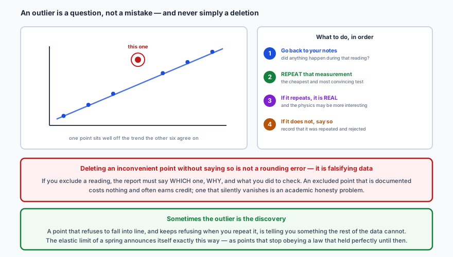
- Identify an outlier, and describe what to do about it — including what to write down.
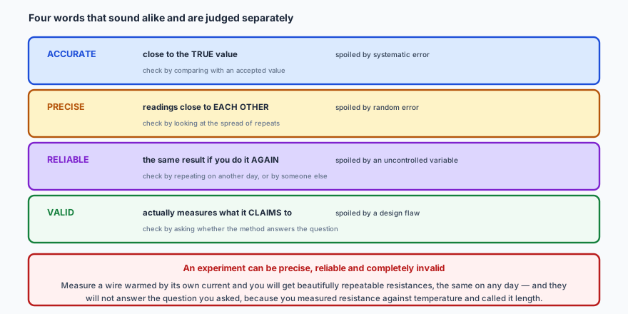
- Distinguish accuracy, precision, reliability and validity.
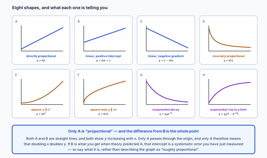
- Recognise the common graph shapes and say what relationship each one indicates.
- Choose what to plot so that a curve becomes a straight line.
📋Recording the data
A results table is a piece of communication, and it is marked as one. Raw data — the numbers you actually read off instruments — goes in first, exactly as read, before anything is done to it.
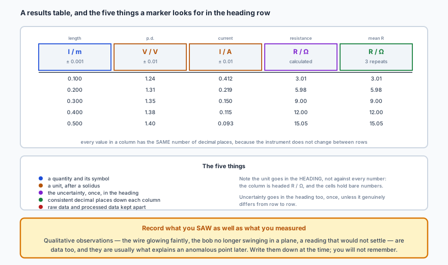
Qualitative observations count as data. The wire glowing faintly, the pendulum bob starting to swing in an ellipse rather than a plane, a meter reading that would not settle — these are the things that explain an anomalous point three hours later, and you will not remember them if you do not write them down at the time.
🔢Processing it
Processing is anything you do to the raw numbers: averaging repeats, subtracting a background, converting units, calculating a derived quantity, squaring a value so the graph comes out straight. Processed data goes in its own columns, clearly separated from the raw.
Show one sample calculation in full, for one row, so a reader can check what you did — then present the rest as a column of results. Repeating the arithmetic ten times proves nothing and wastes space.
✏️Worked example 1 — processing one row properly
Mean of the repeats.
Uncertainty from the spread. Largest − mean = 0.27; mean − smallest = 0.23. Take the larger and round to one significant figure: ± 0.3 s.
Divide by the number of oscillations. Value and absolute uncertainty both divide:
Square it. A power multiplies the percentage uncertainty:
So this row contributes the point \( (0.600, 2.44 \pm 0.05) \), and that ± 0.05 s² is the error bar.
⚠️Outliers
🎯Four words that are judged separately
📈Looking for the trend
Plot the data and the shape tells you what kind of relationship you have. Eight shapes cover almost everything at this level, and being able to name them on sight is worth real marks.
✏️Worked example 2 — deciding what to plot
Rearrange into \( y = mx + c \) form. If \( I = k/d^{2} \), then
which is \( y = mx \) with \( y = I \), \( x = 1/d^{2} \) and \( m = k \).
So build a new column. For each distance, calculate \( 1/d^{2} \):
What confirms it. A plot of \(I\) against \( 1/d^{2} \) that is a straight line through the origin. Both parts matter: straightness confirms the inverse-square form, and passing through the origin confirms there is no constant background light being picked up.
📝Practise
Work through these, then reveal the answer. Each question targets a different objective from the list above.
1. A student writes a column heading as “Length (cm)” and records 12.4, 15, 18.60, 21.2. Identify three faults.
No uncertainty. The heading should carry it once, for example “length, \( l\,/\,\text{cm}\ (\pm 0.1) \)”.
The unit convention. The IB convention is a solidus, so \( l\,/\,\text{cm} \) rather than “Length (cm)”. A symbol for the quantity should also be given, since the graph axes and any calculations will use it.
2. Explain the difference between raw and processed data, and state what a report must show for each.
Processed data is anything calculated from it: a mean of repeats, a background-corrected count, a unit conversion, a derived quantity like resistance, or a squared value plotted to straighten a graph.
The report must show all the raw data, at least one sample calculation written out in full for each kind of processing, and then the processed results as a column. Showing every calculation is unnecessary; showing none makes the processing unverifiable.
3. Three timings for 20 oscillations give 24.6, 24.9 and 24.4 s. Find the period with its uncertainty.
Spread: largest − mean = 0.27; mean − smallest = 0.23. Take the larger, round to one significant figure: ± 0.3 s.
Divide by 20 — both the value and the absolute uncertainty divide: \[ T = \frac{24.63}{20} = 1.232\ \text{s}, \qquad \Delta T = \frac{0.3}{20} = 0.015\ \text{s} \] So \( T = 1.23 \pm 0.02 \) s, rounding the uncertainty to one significant figure and matching the value to the same decimal place.
4. A count rate is measured as 418 counts per minute. The background is 32 counts per minute. State the corrected rate and explain why the correction must come first.
It must come first because the background is present in every reading, so it is a systematic addition to all of them. Halving a raw count rate to find a half-life, or plotting \( \ln R \) against \(t\), gives the wrong answer if the background is still in there — the numbers being halved or logged are not the source's count rate at all.
The effect is worst at low count rates: when the source has decayed to 40 counts per minute, an unsubtracted background of 32 makes the reading nearly twice what it should be, and the tail of a decay curve is exactly where that distortion shows.
5. One point on an otherwise clean straight-line graph lies well off the trend. Describe what you should do, in order, and what the report must say.
2. Repeat that measurement, if the apparatus is still set up. This is the cheapest and most convincing test available.
3. If it repeats, it is a real feature of the system and not an error — and the physics may be more interesting than expected.
4. If it does not repeat, the original was a one-off mistake and may be excluded.
The report must state which point was excluded, why, and what was done to check. A documented exclusion is fine and often earns credit; a point that silently disappears is falsification of data, which is an academic honesty matter rather than a technical one.
6. Distinguish reliability from validity, and give an example of an experiment that is highly reliable and completely invalid.
Validity is about whether the method measures what it claims to. It is undermined by a flaw in the design, and no amount of repetition can reveal it.
Example: measuring the resistance of a wire while a large current flows through it. The wire warms up, its resistance rises, and the readings settle to a repeatable value — the same tomorrow, the same for anyone else. Highly reliable. But the experiment claims to measure how resistance depends on length while it is really measuring how resistance depends on temperature, so it is invalid. Reliable and wrong.
7. A graph of \(y\) against \(x\) is a straight line that does not pass through the origin. State the relationship, and explain why it is wrong to call it proportional.
It is not proportional, because proportionality means \( y = kx \) with no constant term — and only then does doubling \(x\) double \(y\). Here, doubling \(x\) does not double \(y\), because the constant \(c\) is carried along unchanged.
If theory predicted proportionality, that intercept is evidence of something: most often a systematic error such as a zero error or a background reading. Identifying what it is turns a disappointing graph into a successful measurement of the error itself.
8. For each, state what happens to \(y\) when \(x\) doubles: (a) \( y = kx \); (b) \( y = kx^{2} \); (c) \( y = k/x \); (d) \( y = k\sqrt{x} \).
(b) \(y\) becomes four times as large, since \( 2^{2} = 4 \).
(c) \(y\) halves — inverse proportion.
(d) \(y\) increases by a factor of \( \sqrt{2} = 1.41 \).
This is a quick way to identify a relationship from a table without plotting anything: find two rows where the independent variable doubles and see what the dependent variable did. It is also a good check on a graph you have already drawn.
9. A student expects \( I \propto 1/d^{2} \). State what they should plot, and what two features of the resulting graph would confirm the relationship.
Two features confirm it:
Straightness — confirms the inverse-square form specifically, as opposed to some other falling curve.
Passing through the origin — confirms there is no constant offset, such as background light reaching the sensor. An intercept would mean the sensor reads something even when \( 1/d^{2} \to 0 \), that is, at infinite distance.
10. Explain why plotting \(I\) against \( 1/d^{2} \) should influence which distances you choose to measure at.
That leaves most of the graph determined by a handful of close-range points, which is exactly the narrow-range problem from I.1 in disguise.
The fix is to choose distances that are evenly spaced in \( 1/d^{2} \) rather than in \(d\) — for \( 1/d^{2} \) values of 4, 8, 12, 16, 20, the distances are 0.50, 0.35, 0.29, 0.25 and 0.22 m. Deciding what to plot is therefore part of designing the experiment, not something to leave until the data is already collected.
🔗Go deeper — other people’s work
These are external resources, not mine. If one stops working, tell me and everything above it on this page still stands.
- The IB Physics guide internal assessment criteria — how data collection and processing are marked
- Vernier and PASCO teacher notes — worked examples of well-laid-out results tables